Choose a colour that has a meaning which would like you to explore and celebrate.
Brown was my first choice for this assignment. I started to make an illustration in
Photoshop and this is what I came up.

Than after a day of thinking I realised that this is not the
colour that represents me anymore. It used to then I was in the high school;
however now I am close to the other colour. Now I can say that BLUE represents
me the most.
BLUE


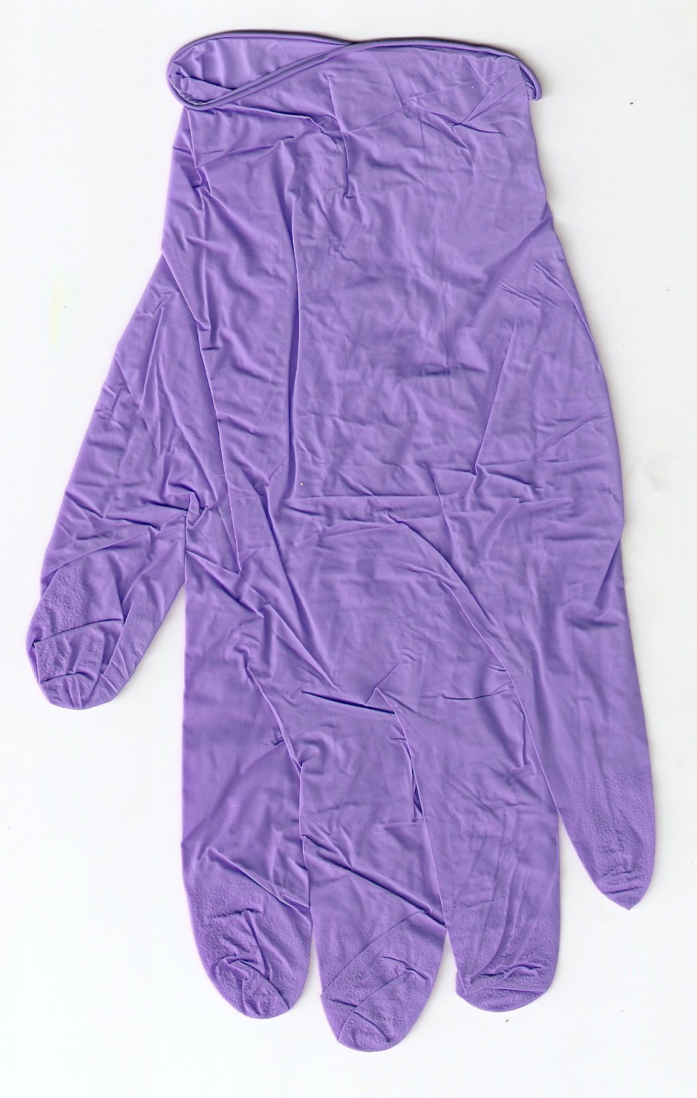
Blue glove often used in health departments

A scarf- a gift from my Nan when I was going to
.jpg)
A piece of knitted material for kids

A scanned knitted star

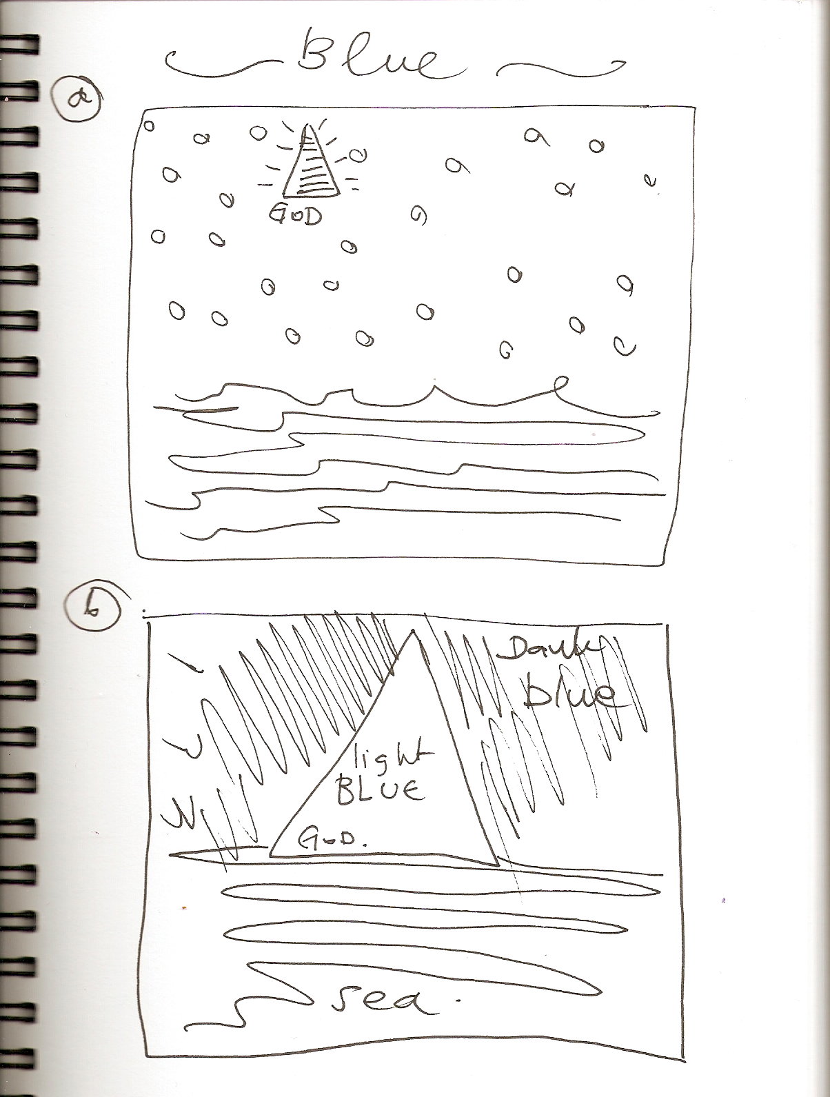
Variation no.1
Variation number one came suddenly; it does not have any
deeper meaning like being an idea for the first illustration. I wanted to check
the composition and overall look by using all elements on one surface. I
think it is a good starting point for this assignment number 3.

Variation no.2
I started to work on the composition in variation number 2. I managed to separate some of the components
from each other however; I do not think it works well all together. I like the
idea of the sea made from blue and white knitted material. This part will definitely stay. I will also leave the dotty blue scarf as a background
as I think it works well.
However, I think I will come back to the idea of the
person in side of blue circle, as this could be a symbol of me being pregnant now. It works well as a metaphor of a womb.

Variation no.3
Variation number three looks different from the one above in
terms of the whole concept and the composition. I scanned on of my top then I
managed to use a computer program to cut it and past it in the proper place. I wanted to make a church in the middle of globe,
as the spiritual part of our life is very important to me. I decided to leave more space and make the
composition more open. It works well however I m not please with overlook. I
like the idea of the cloud made from the same material as the sea on the
illustration number one and two although I do not think it makes sense.

I came back to the idea of the sea as bigger part of the illustration. I think it represents me in many ways; first,
it brings us a picture of an open space, the space that I crave many times in
my life. Secondly, my signs of the
zodiac are Pisces that come from the sea. Thirdly it represents my personality,
sometimes I can me calm and peaceful when the other time I can my strong and loud.
The other part of the illustration is the church that is still there however I
moved it in to the left corner. I came back to the idea to keep the little
figurine as a part of the illustration. I did not place her in the centre of
the blue ball just to check the other option that I had. Overall I still think
I prefer to have the figurine in the middle of the ball as a symbol of
pregnancy and new life.

Finished artwork
This is my finished illustration . I managed to combined all
elements on one surface. I used the blue gloves from my current work to shape a
triangle as a metaphor of the God. The Picasso’s bird is the symbol of peace. I
came back to the idea of the figurine in the middle of circle as a metaphor of motherhood.
I have also placed the sea as a major part of the illustration. I am very happy
to have the opportunity to use the either black or white colour in this project.
This time I went for the black colour as it makes a good background for my
illustration. It gives a nice finish to my artwork.

500 words evaluation
Assignment 3 – Colour me!!
This was a very interesting assignment. I am sure that this is just the beginning of
my wonderful journey with graphic design.
The task seemed to be very easy, however the more I was working on it,
the more difficult it was. It was
difficult for one reason as the colour I chose was close to someone who sadly
is no longer with us, that person was my Nan .
Blue is a colour related to her. The meaning of this colour for some people is
different, sometimes you may think about the sky, sometimes about the sea. It is a colour of truth, relaxation, healing
and peace. At the same time, it brings a
cool temperature and a nice fresh breeze to you. All those points come together and create a
beautiful picture of my Nan , someone so important to me,
someone who had an amazing and big impact on me.
The exercises in this part of the course helped me to create
a final illustration for this assignment.
I took a lot from the exercise called “Seeing the light” where I had to
produce more than 20 designs that explored visual dynamics. I was definitely more comfortable with moving
items around in my illustration and coming up with a good composition.
Exercise “Understanding colour” was definitely a big help
for me. I managed to work with one main
colour and another complementary colour easily without any doubts. Exercise “Abstract cities” from the project
“Working with colours” was more advanced than the two previous exercises. . Now
I may say I can easily build a picture based on colours and simple shapes. I found this new technique for me very
exciting. I took a lot from this task
which I could use in the assignment. The
blue picture I designed could have been created with simple blocks of colour,
however I decided to make it more interesting and converted it into a collage,
by using objects such as blue gloves.
Exercise “Photomontage” played a big part in my creative
process. This was a task to create a
picture with a political message. For as
long as I remember I have always liked this technique as it gives a lot of
possibilities and chances to be creative.
It gives an opportunity to create new meanings out of already existing
pictures. This time it fitted perfectly
with an idea for this assignment to create a poster about me. I used scanned materials like blue rubber
gloves from the NHS hospital where I work, as well as my Nan ’s
blue scarf and two other materials. I
used a copy of Picasso’s White Dove, which symbolises peace. I also found a place for a blue stone scanned
from a magazine.
To sum up my work, I would like to add a few words. Part three of my study books was full of
interesting exercises that lead me towards expanding my skills as a future
graphic designer. I know that the
finished poster looks like an illustration, however I can see a progress in the
way how I think about objects and composition.
In particular the project with a light bulb has opened my eyes towards a
new way of exploring the amount of possibilities that one picture may
have. It is a fun and creative part of
being a graphic designer; sometimes less is more. I am looking forward to assignment four.


