Sunday 29 April 2012

book cover design part 2

I spent another day on this project trying to design a few good covers from which I would like to choose only one.
All of my illustrations are still in progress therefore I cannot make decision about where the title and the name of the author will be.


First idea is based on technique called collage.  I used the drawing of monkey in the foreground, than I placed pink and green colours as a background.  I tried to build a tree from scanned cardboard pieces.  I still need to work on every part of this illustration.  
illustration number 1


                                                                    illustration nymber 2


Second idea is very simple, based on ink and pen drawing.  I created a portrait of man that could be Dr.Moureau however; I did not want to say that.  I would like to live this to a personal interpretation.  I used he image of island that I took in Spain last year and changed it into an ink drawing in Photoshop.


                                               illustration number 3


Third illustration came from an idea of monkey in a man’s mask or man in monkey’s mask.  This is just a first stage of this possible illustration but from the beginning, I know that this does not look well.  I am not going to continue my work on this illustration.


                                             illustration number 4


Sketch for this illustration came from an idea of man’s face with some scar that reminds of his hard life.  Some sort of an interesting and mystery part of his personality.  I wanted to make his scar in the shape of an island.  His eyes should look tired and angry at the same time.
I will see if I come back to this idea.........


.........After a few days of not working on this exercise , when I thought that I have explored all my ideas  I took my sketch pad and draw another illustration.

I took this course more seriously after receiving my tutor report from the assignment nr.1.  Therefore, I came up with another illustration that I will work longer.


This is such a simple idea, but I like it so much.  There is an island build on an open mouth, so wild and unpredictable that the reader will get a shivers just from folding this book (I hopeJ).  I draw a couple of palm trees to make it more visible.


I used the blue fragment of my old painting to create a nice colour and texture for a sea.


I am not sure do I like this version of dark colours.  I know that I would like to build this atmosphere of mystery by using different textures and colours.  However, this is not the best that I can do!


I decided to take some of the colours from the island and see how it looks like.  Hmm, I am still not sure about this illustration.  


My next idea was to keep it as simple as I could.  Therefore, I left only dark colour with hot red tongue and some flames on the sky.  I left only one blue part of the sea and the rest I made black.


I am more and more happy with the look, however I thin that I do not need this sky to make my illustration visible.  Now when I removed it and replaced it with this simply white background I am starting to like it.  

I have also changed the structure of the main wave; make it more dangerous by adding that black dark colour.  I decided to reduce the amount of blue lines to keep it simple and clear.


I knew that I would like to have a framed illustration on the front cover, therefore I used thin black and bit thicker white one.


I changed the colour ob white border into the purple that looks more distinguish.

Now I have to make a decision on the logo for my imaginary book publishing.

I came up with an idea of “Tree Publishing” or “The Giraffe Publishing”.  I think that I should go with the second idea.


Now when I am almost happy with the front cover it is time for me to design the back.


design 1                                                                                                     design 2


                                                         design 3


I spent quite a lot of time to design the back of this book.  I wanted to have a stylish cover and be able to produce a range of books.  I know that they need to look like they come from the same publishing so I have to be happy with my first accomplished design. The design nr.1 looks good to me but beside the colour of the purple border, there is nothing from the front of my book.  The design nr.2 is closer to my expectation but it looks to busy and I am afraid that the description of the book may disappear.  Than I decided to go with the black wave from the front, design and that will leave some space for the book description.  So far, I really like it J  


Fonts that I used for this exercise:

·        Lithos Pro Regular   for the title

·        BYINGTON  for the name of my publishing and the price

·        COPPERPLATE GOTHIC LI.  For the fiction


This is my book cover.  I am very happy with the result and do not want to make any changes!  

23.04.2012


another book is the invisible man 


stage 1                                                                                                               stage 2


stage 3                                                                                                                  stage 4


stage 5                                                                                       stage 6


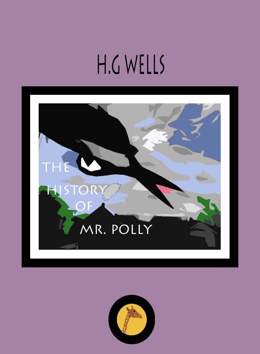
THE history of Mr.Polly


Sunday 15 April 2012

Project: Researching and developing ideas

Exercise :


Book cover design


After reading a book called “The Island of Doctor Moreau” wrote by H.G. Wells, after research I came up with a few ideas for a book cover. The atmosphere of this book is full of mystery events associated with the figure Dr.Moreau.


                                                                      Edward Bettison

Edward Bettison is the author of this project.  I got this book from the nearest library and I had time to have a close look on the design.  It catches a viewer eye with the dark green colours.  The mysterious easy hidden behind the palm trees are very hypnotising. I really like it overall.

                                                      
                                                                         Zach Hobbs

I like this interesting book cover design by Zach Hobbs.  It has very scary mood but the space has been used in very query way. I like the style of this collage, which reminds me of the posters from 1920 -1930.


I could not find the name of this artist however; I decided to use this illustration on my blog as an inspiration.  The strongest point of this book cover is the simplicity.  The colours are only black and white and they work well with the image of this monster.


I do not want to copy any existed already ideas however, it is hard not to fallow few determinants like  island, palm trees, the dominant green colour and strange animals. Therefore, I know if I do not work on the style of my illustration, the book cover will not look original.

Incidentally, the photo of a dog with the mask of butterfly was stuck in one of my book.  I would like to design a similar picture however; instead of a dog, I will have a man with an animal mask.  I would like to create an image, which says that there is a monster in every man.  


I did a few sketches that may be good for this task.


Tuesday 10 April 2012

Part Two - Problem solving

I got my first tutor report and it made me think bit more about my course. I have to say tha I did not put enough effort into my studding lately.
I remember one day at primary school when my tutor said to me: Kasia, you are very talented girl but that laziness is standing on your way to become a successful student.”

 That sentence came back to me when I was reading OCA tutor report a few days ago.  This time is all about putting more effort into the blog .  I will use OCA blog as a good way to express my thoughts and creative thinking process.  I know I did not spend enough time on documenting my studding so far but that is going to be changed. 

There was another event in my life a couple days ago, that made me thinks differently about my course.  This was during BBC program:  Riots and Revolutions: My Arab Journey about Egypt and horrible situation a year after the revolution.  I know that I am very lucky to be able to study what I want.


Exercise: Working to a brief